sillydoll
Veteran Member
- Time of past OR future Camino
- 2002 CF: 2004 from Paris: 2006 VF: 2007 CF: 2009 Aragones, Ingles, Finisterre: 2011 X 2 on CF: 2013 'Caracoles': 2014 CF and Ingles 'Caracoles":2015 Logrono-Burgos (Hospitalero San Anton): 2016 La Douay to Aosta/San Gimignano to Rome:
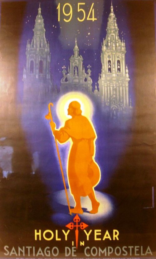
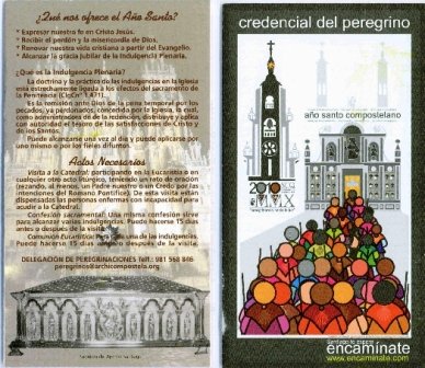
The front page is the poster designed for the Holy Year:
The poster has been made by the company to Enxeño Galicia Archdiocese Santiago de Compostela. Explanation of the cartel Modesto Gomez, director of Exene Galicia:
We envision the road as a melting pot of people who, with their multitude of colors, pilgrims of the hand toward a goal.
We envision a destination and draw la Quintana peregrina its essence: its threshold of reconciliation, the prelude to the embrace that allows us to open ourselves to the world Obradoiro Glory.
We envision a style and decided to compose a mural can symbolize the plurality of the road: rounded at the base and bottom line at the top, colorful in its origin, while sober and full of air in the top half while chromatic clean, decorated with a scheme which simplifies the interpretation of three distinct parts that intersect naturally: the representation worldly, full of life and color, characterized by a multitude pilgrim, the spiritual, driven in that ethereal mix of chiaroscuro and unencumbered the silhouette of the cross, and a central plane in which the cathedral is the goal of the Path.
Obradoiro blurring the towers in an overhead shot imaginary, we highlight the vision of la Quintana as Plaza with the presentation of Tower Clock and Holy Door in a composition of simple lines and gray, adorned by colorful and rounded lines on special importance ...
At the door are three elements that stand out: first the images that humanize the stone. On the other, forming a central axis, two representations of the apostle. How could it be otherwise in the case of la Quintana, Place of living and dead, an apostle recumbent, which is the guiding light at the end of the road, rises above the door in its niche as a living witness of Christ and the pilgrim who, as a good host, awaits us at home.
To his right, the clock tower stands as a beacon of hope, a symbol of three essential elements: the clarity, the call and time. It's more symbolic of the temple tower. It represents, in descending order, a glimmer of hope that flows from its guiding light, a perennial call to conversion that resonates in each "badalada 'of the BerengariaAnd a gentle discourse of hours to the rhythm of the needles of a clock that evokes our lives and our history. At the base we wanted to establish a modern, simple and illuminating logo: from the Roman era to today, Pilgrim Church, at the hands of the cross and Vieira, icons of Jesus and James, pilgrimage guided by the light of Christ, walking together, hand in hand with faith, from 2010 years ago.

")