
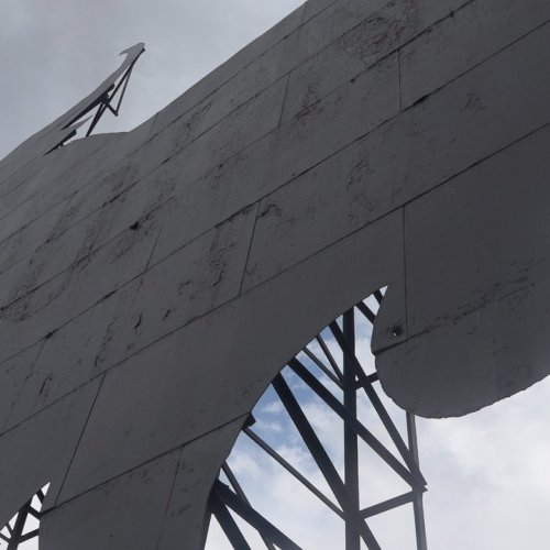
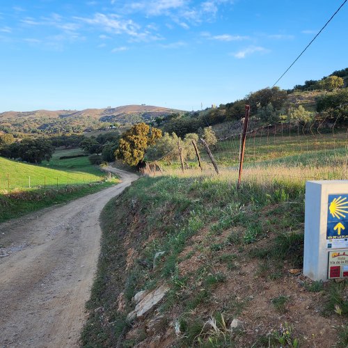
I know that many people have commented/complained about the poor choice of color (dark metallic cutout) for the camino Olvidado waymarkings. Ender tells me that the design will remain the same as is (using the logo on the official website). But the big change is that the dark metallic color will be exchanged for a bright yellow. From one extreme to the other, it seems, but this will definitely be easier to spot!
-
For 2024 Pilgrims: €50,- donation = 1 year with no ads on the forum + 90% off any 2024 Guide. More here.
(Discount code sent to you by Private Message after your donation) -
 ⚠️ Emergency contact in Spain - Dial 112 and AlertCops app. More on this here.
 -
Camino Olvidado Guide created by one of our forum members
Search 69,459 Camino Questions
Improved signage for the Olvidado - coming soon!
- Thread starter peregrina2000
- Start date

❓How to ask a question
How to post a new question on the Camino Forum.
Similar threads
-
 LIVE from the Camino A few days on the Olvidado
- Started by alansykes
- Replies: 13
-
Olvidado accommodation
- Started by jerry lordan
- Replies: 36
Forum Rules

Camino Updates on YouTube

Most downloaded Resources
-
 “All” Albergues on the Camino Frances in one pdf“All” Albergues on the Camino Frances in one pdf
- ivar
- Updated:
-
 A selection of favorite albergues on the Camino FrancésFavorite Albergues along the Camino Frances
- Ton van Tilburg
- Updated:
-
 Profile maps of all 34 stages of the Camino FrancesProfile maps of all 34 stages of the Camino Frances
- ivar
- Updated: