• Remove ads on the forum by becoming a donating member. More here.

Search 74,075 Camino Questions

Forum upgrade hiccups?

Time of past OR future Camino
Various 2014-19
Via Monastica 2022
Primitivo 2024
The newest upgrade looks great, @ivar.
as usual it may take a little time get used to the changes in format. But I have a few immediate questions:

First, what happened to the little button it looks like a cog-wheel in the upper right hand side of the menu bar? It's the one that allowed you to see the formatting of your post as you were writing it, or to enter the formatting manually. It seems to be gone. If so it's a pity, because it was the best means to fix improperly nested quote boxes.
Edit - found it, thanks to @Rick of Rick and Peg.
It's the bracket icon in roughly the same location.

The second question has to do with photo attachments. Many of us attach photos to a post without actually inserting the photo into the message. Before, doing that would give you a clear thumbnail that appeared at the bottom of the message which you could click on if you wanted to see the full size image. It saves space and allows the thread to load more quickly. Now if you do that the photo is larger, but blurry. Is there a fix for this?

I'm also wondering if it is possible to add tags to a thread after you have initially posted it. I can't see how to do that in the new system.
 
Last edited:
Perfect memento/gift in a presentation box. Engraving available, 25 character max.
Great... I see you found the answer to one of your questions. This new forum version is new to me as well, so I would need to look for the answers myself..

Not sure what is going on with the photos... if it is blurred, could it be that it has not finished loading?

Regarding the tags, you can not create a new tag, but you need to pick a tag that has already been used.. if you would like to suggest a new tag, please let any of the mods (or me) know and we will have a look and maybe create it.

Hope this helps!
Ivar
 
Edit - found it, thanks to @Rick of Rick and Peg.
It's the bracket icon in roughly the same location.

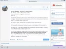
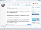
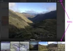
Am I right that there are two steps now to activate the ability to use the toolbar across the top of the post— first click on the three vertical dots, and then hit on the bracket icon that shows below? I’ve attached several screen shots. First one shows nothing highlighted. Second one shows what I see when I click the three vertical dots. Third one shows what it looks like when I highlight the bracket, and the bold, italic, etc features darken and can be used. Luckily, that doesn’t have to be done on each post, once you click on the bracket it stays the same for all posting unless or until you change it.

Moving on to some more questions —
Can someone explain what the other icons below the three vertical dots are?

The first one, the clockwise half circle with an arrow, is not highlighted. Not sure what it is.

The second one, a right-leaning rectangle with a line through it and a line under it — Clicking on and off doesn’t make anything happen for me.

The third one, the disk-like image with an arrow next to can be used to save or delete a draft. I think this is an improvement, because what I remember was that sometimes going away from a draft resulted in losing a draft, and sometimes even if I deleted a draft it would reappear when I went back to post something — I assumed it was part of an automatic save feature, not a big deal, but this is clearer.

And Ivar, like VN, I see my attached screen shots as very blurry when they are in thumbnail version, but when I click on them it all clears up.

Thanks for the upgrade, thanks for the help in getting us all up to speed with the upgrade, and most of all thanks for the patience! Buen camino, Laurie
 

Attachments

  • 8269DE5C-2128-4260-8FFB-8B95FB97DB05.webp
    8269DE5C-2128-4260-8FFB-8B95FB97DB05.webp
    199.5 KB · Views: 105
  • 0A3E32DF-7618-4895-B091-3FEC15A4DBEF.webp
    0A3E32DF-7618-4895-B091-3FEC15A4DBEF.webp
    189.1 KB · Views: 91
  • 9B5C547D-F989-43BC-A054-2E60112DAA52.webp
    9B5C547D-F989-43BC-A054-2E60112DAA52.webp
    181.3 KB · Views: 77
The 2024 Camino guides will be coming out little by little. Here is a collection of the ones that are out so far.
Third one shows what it looks like when I highlight the bracket, and the bold, italic, etc features darken and can be used. Luckily, that doesn’t have to be done on each post, once you click on the bracket it stays the same for all posting unless or until you change it.
The bracket icon is equivalent to the old cogwheel icon, which when activated put you in manual mode so that you enter im code whatever quotes, formatting, and other stuff you might want to do with your text.
 
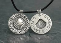
A selection of Camino Jewellery
Am I right that there are two steps now to activate the ability to use the toolbar across the top of the post— first click on the three vertical dots, and then hit on the bracket icon that shows below? I’ve attached several screen shots. First one shows nothing highlighted. Second one shows what I see when I click the three vertical dots. Third one shows what it looks like when I highlight the bracket, and the bold, italic, etc features darken and can be used. Luckily, that doesn’t have to be done on each post, once you click on the bracket it stays the same for all posting unless or until you change it.

Moving on to some more questions —
Can someone explain what the other icons below the three vertical dots are?

The first one, the clockwise half circle with an arrow, is not highlighted. Not sure what it is.

The second one, a right-leaning rectangle with a line through it and a line under it — Clicking on and off doesn’t make anything happen for me.

The third one, the disk-like image with an arrow next to can be used to save or delete a draft. I think this is an improvement, because what I remember was that sometimes going away from a draft resulted in losing a draft, and sometimes even if I deleted a draft it would reappear when I went back to post something — I assumed it was part of an automatic save feature, not a big deal, but this is clearer.

And Ivar, like VN, I see my attached screen shots as very blurry when they are in thumbnail version, but when I click on them it all clears up.

Thanks for the upgrade, thanks for the help in getting us all up to speed with the upgrade, and most of all thanks for the patience! Buen camino, Laurie
Clockwise circle with arrow is "Redo". I assume it either redoes your last action or if you change your mind about an undo, redoes. The leaning rectangle will remove formatting from selected text. This is probably most useful if you copy text from somewhere else and paste it into your message and it brings unwanted formatting with it. The disk image with an arrow is for "Drafts". I assume that means you can save drafts of a message before posting and access earlier drafts. When I click on the arrow I get the options to save or delete drafts.
 
I no longer see a preview button. It looks like the paper and magnifying glass icon is its replacement. Its action is different though as it appears to show the preview in the same place you are entering text and you have to click it again to get back to entering text.

Edit: It doesn't look like it does much but it really does. I experimented and entered bulletin board markup into my text (the equivalent of using the B icon). When I clicked the paper and glass icon the brackets in my text disappeared and the text appeared bold.
 
Last edited:
€2,-/day will present your project to thousands of visitors each day. All interested in the Camino de Santiago.
Ok, here is Rick’s advice from the other thread on inserting pictures.

There are three ways to attach a photo. 1) Pick out the file(s) and then post the reply without doing anything to the picture(s) and that gets you what used to look like a cardboard mounted kodachrome slide. It looks different now but it still has text of file data attached to a small version of the picture. 2) Thumbnail if you pick that. 3) Full size if you pick that.

The way of choosing between 2 and 3 now is to choose the insert ... menu printed on the image on the top left and then choose thumbnail or full size. There is a delete icon on the top right also.

My questions:

Am I correct that using method 1) means that the thumbnail will always look blurry?

I have tried to attach the same picture using all three methods. I think it’s correct to say that when left as attachments without being inserted in the picture, the photos are blurry. But clicking on them makes them clear.

DE3FA3EF-27CC-4014-B4EE-AAF9469BB978.webp


82E96968-617E-439B-8F9F-0E02E1066967.webp
 

Attachments

  • D5795211-81E1-41D8-A52E-5A7E6481D7CD.webp
    D5795211-81E1-41D8-A52E-5A7E6481D7CD.webp
    2 MB · Views: 59
3rd Edition. More content, training & pack guides avoid common mistakes, bed bugs etc
The 2024 Camino guides will be coming out little by little. Here is a collection of the ones that are out so far.
Hi,
You are all probably asleep now! Just done some experimenting and find that when I (Anne) try to edit using the more options on the right, the toggle BB code and change the picture from Full size to Thumbnail, the picture does not change size, it stays as full size!? What am I doing wrong?
Thank you all for your help with this.
Anne & Pat
Hi, Anne,
I just tried to do what I think you were trying to do, and I posted one of yours as a thumbnail and one version as full size, and the two sizes are virtually identical, so I don't know what is going on!

Buen camino, Laurie
 
Hi,
You are all probably asleep now! Just done some experimenting and find that when I (Anne) try to edit using the more options on the right, the toggle BB code and change the picture from Full size to Thumbnail, the picture does not change size, it stays as full size!? What am I doing wrong?
Thank you all for your help with this.
Anne & Pat
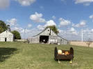
For a test I'm inserting a full size picture (a farm photographed on our walk today). I'll try to change it to a thumbnail after I do the initial post.
View attachment 85051

Edit: I've tried a number of edits but none worked. One change caused the picture to disappear and a View attachment link to appear instead.

Edit: Mea culpa. I gave directions somewhere on how to edit to shift between thumbnail and full size and go the other way too. They used to work but not now with the change.
 
Last edited:
Perfect memento/gift in a presentation box. Engraving available, 25 character max.
6DEBD812-6312-4AE9-872F-6D9A4AA50C38.webp

Hi Laurie & Rick,

Just tried to attach this photo from a local walk using the Attach Files button down on the left lower corner, then clicked in the Insert button on the photo, Thumbnail and a full size photo came up.
Like you Rick, don’t know what is happening.
I note that some of you managed to insert Thumbnail photos overnight (Oz time) into the One Day at a time, One Photo at a time thread. I wonder how that happened?
Thanks for your help.
Anne
 
Last edited:
This morning, like you @Anne&Pat , I did this to successfully attach a Thumbnail image in the "One Photo a Day" thread:

Click on Attach Files
Choose the photo and click on Open
On the photo in the upper Left corner, click on Insert
An option comes up to choose Thumbnail or Full Image.

Something must have changed since this morning because when I choose Thumbnail now (pictured below) it attaches as a much larger image. When I choose Full Image, the photo is too large fit the message area.

angel's bonnet.jpg
 
This morning, like you @Anne&Pat , I did this to successfully attach a Thumbnail image in the "One Photo a Day" thread:

Click on Attach Files
Choose the photo and click on Open
On the photo in the upper Left corner, click on Insert
An option comes up to choose Thumbnail or Full Image.

Something must have changed since this morning because when I choose Thumbnail now (pictured below) it attaches as a much larger image. When I choose Full Image, the photo is too large fit the message area.

View attachment 85056

Hi, yes agreed. But I have just posted my photo for today on the "One photo a day" thread and have said how I managed to do it. But I liked the old way better!
 
3rd Edition. More content, training & pack guides avoid common mistakes, bed bugs etc
Something must have changed since this morning because when I choose Thumbnail now (pictured below) it attaches as a much larger image. When I choose Full Image, the photo is too large fit the message area.
I have to say I like this.
You can actually see the photo without having to click on it for a larger size.
Two👍👍
 
And much appreciated by those of us with ultra low speed internet.
 
Perfect memento/gift in a presentation box. Engraving available, 25 character max.
This morning, like you @Anne&Pat , I did this to successfully attach a Thumbnail image in the "One Photo a Day" thread:

Click on Attach Files
Choose the photo and click on Open
On the photo in the upper Left corner, click on Insert
An option comes up to choose Thumbnail or Full Image.

Something must have changed since this morning because when I choose Thumbnail now (pictured below) it attaches as a much larger image. When I choose Full Image, the photo is too large fit the message area.

View attachment 85056

I will ask Ivar about impact on speed, but my experimentation has led me to the same conclusion as others’— the inserted thumbnail is much bigger than it used to be.

We still have the option of leaving the picture as an attachment (as either a thumbnail or full image) and I wonder if that is preferable for those with slow internet.
 
I do not have any forum source code and I don't have access to Ivar's systems but I have had fun with the web for a long time and I often look at the the HTML source of webpages. I peeked at what happens with the pictures with the latest forum upgrade and here are my guesses as to what is happening.

It looks like copies of thumbnails are stored on one or more servers across the world. Ivar must have a contact with a distributor who places them on a number of systems. This means that when a page full of thumbnails is presented to you the thumbnails are coming from a system near you and thus the page loads faster. Also this means that Ivar's systems are not so busy doing such simple work and thus are faster doing the important work. However, when you click on a thumbnail the enlarged picture is served from Ivar's system. So, not only does having thumbnails make the presentation of a webpage faster on the client (fewer bytes to load to get a tiny picture) it also makes the job easier on the server (fewer bytes and file accesses to handle).

Now here are my guesses about the thumbnails. It looks like the older versions were scaled so the longer of the height or width of the full size picture became 100 pixels. It now looks like that figure is 500 pixels so thumbnails are now 25 times larger than they were. But it also looks like the compression of the thumbnail jpeg files is now higher to make storage costs on those remote servers cheaper and also make the webpage get served faster because there are fewer bytes being transmitted. The compression reduces the quality of the picture and this may account for the blurriness of the thumbnails that people have commented on. I see that the thumbnail has a comment buried within it that says the image quality is 85%.

Ivar, do you have any comments?

Edit: Written before @peregrina2000 sent in her post (#25 above) but posted after.
 
...and ship it to Santiago for storage. You pick it up once in Santiago. Service offered by Casa Ivar (we use DHL for transportation).
I will check that out, @Theatregal. First, Ivar has told me he has changed something on the photo attachments, so let’s try again. The first photo is after clicking on inserting thumbnail.

The second is inserting full image.

And I have also done an attachment and left it as an attachment.

Does this look better?


DE22FABA-CBB0-40F0-ADF2-FBEE5FFCED53.jpeg


DE22FABA-CBB0-40F0-ADF2-FBEE5FFCED53.jpeg
 

Attachments

  • D4F46222-E51A-473A-877E-01E977F97189.webp
    D4F46222-E51A-473A-877E-01E977F97189.webp
    87.3 KB · Views: 44
I will check that our, @Theatregal. First, Ivar has told me he has changed something on the photo attachments, so let’s try again. The first photo is after clicking on inserting thumbnail.

The second is inserting full image. Does this look better?


View attachment 85102


View attachment 85102

That is so strange.When psoting a pic and clicking on thumbnail I always get the bigger format and not the smaller one.
 
€2,-/day will present your project to thousands of visitors each day. All interested in the Camino de Santiago.
Here is another test. I have done it three ways:

— attach a photo and leave it attached

— attach a photo and upload a thumbnail. (clicking on the thumbnail brings up a bigger size)


E3DD3F68-8734-4642-8170-8ABB8DB9E2A4.jpeg

— attach a photo and upload full size

A58E96EE-6146-401C-8CC0-735C6173AE6D.jpeg


Is this how it is supposed to be? Or how people like it to be?
 

Attachments

  • F1056850-C50C-4808-9966-14D6DEE6F8B2.webp
    F1056850-C50C-4808-9966-14D6DEE6F8B2.webp
    1.5 MB · Views: 52
Perfect memento/gift in a presentation box. Engraving available, 25 character max.
Just posted this on the Where Did You Walk Locally thread re: something I just noticed on the photo threads and I wonder if it's happening for others. If you start scrolling through photos in a particular post, it will continue to scroll through all the photos that people have posted on the whole page.

I have just turned this off.

What I now notice, which is a really nice feature, IMO, is that if someone posts a bunch of thumbnails on one post, I can click on one and then scroll through all of the pictures on that particular post (not through the whole thread, like Theatregal noticed last night and Ivar fixed this morning). This may have been a feature before, but in any case it’s nice not to have to click on each thumbnail individually.

And just fyi, that is NOT the case if you post a lot of attachments and leave them as attachments. You have to click on each one individually to pull them up. That suggests that using the thumbnail feature is not only helpful for people with limited interenet, but also the easiest way for everyone to enjoy your pictures.
I can turn this on again if people find this useful
 
What I now notice, which is a really nice feature, IMO, is that if someone posts a bunch of thumbnails on one post, I can click on one and then scroll through all of the pictures on that particular post (not through the whole thread, like Theatregal noticed last night and Ivar fixed this morning). This may have been a feature before, but in any case it’s nice not to have to click on each thumbnail individually.

And just fyi, that is NOT the case if you post a lot of attachments and leave them as attachments. You have to click on each one individually to pull them up. That suggests that using the thumbnail feature is not only helpful for people with limited interenet, but also the easiest way for everyone to enjoy your pictures.
Having been watching from the sidelines and admittedly I don't post many pictures, I just wanted to add my 2 cents of observation.

Regarding your post that has 2 embedded pictures and one thumbnail. I clicked on the first picture and it opened nicely. Then I was able to hit the right arrow on the image display overlay and was easily able to see all three pictures, both the embedded and the thumbnail. I verified that as I scrolled I saw three different image file names below the images as they displayed. I only did this because all three pictures were the same.

As for the ability to scroll through all pictures in a thread, well I can see how this would be a nice feature on those threads focused on pictures (no pun intended). I have no opinion one way or the other regarding the enablement of the thread scrolling feature and can see pros and cons either way.

@ivar nice job on the fairly smooth update.
 
The focus is on reducing the risk of failure through being well prepared. 2nd ed.
What I now notice, which is a really nice feature, IMO, is that if someone posts a bunch of thumbnails on one post, I can click on one and then scroll through all of the pictures on that particular post (not through the whole thread, like Theatregal noticed last night and Ivar fixed this morning). This may have been a feature before, but in any case it’s nice not to have to click on each thumbnail individually.

And just fyi, that is NOT the case if you post a lot of attachments and leave them as attachments. You have to click on each one individually to pull them up. That suggests that using the thumbnail feature is not only helpful for people with limited interenet, but also the easiest way for everyone to enjoy your pictures.
Yes, this was a feature before - the ability to click through the multiple thumbnails in one post. Happy it's still the case - as long as the photos are posted as thumbnails that is.
 
I can click on one and then scroll through all of the pictures on that particular post
If I remember correctly, this had been possible before this recent update although I don't recall whether it worked for full photos and/or thumbnails and/or attachments or only for one of these formats. When you positioned the pointer on the photo, left and right arrows appeared that allowed you to move to the next photo or to the previous photo. The same as now.

What is new now is the possibility to start a slideshow of all the photos in a single post. Click on the triangle - top right in a black band just above the photo. The slideshow doesn't work for attached photos but it works for thumbnails and for full photos. My impression is that it works best for thumbnails. I guess thumbnails are the way to go.
 
Last edited:
A selection of Camino Jewellery
If I remember correctly, this had been possible before this recent update although I don't recall whether it worked for full photos and/or thumbnails and/or attachments or only for one of these formats. When you positioned the pointer on the photo left and right arrows appeared that allowed you to move to the next or to the previous photo.

What is new now it the possibility to start a slideshow of all the photos in a single post. Click on the triangle - top right in a black band just above the photo. The slideshow doesn't work for attached photos but it works for thumbnails and for full photos. My impression is that it works best for thumbnails. I guess thumbnails are the way to go.
I was able to scroll through @peregrina2000 photos above, both attached and thumbnail just fine. Didn't seem to treat any of them differently in the display overlay.
 
A selection of Camino Jewellery
What I now notice, which is a really nice feature, IMO, is that if someone posts a bunch of thumbnails on one post, I can click on one and then scroll through all of the pictures on that particular post (not through the whole thread, like Theatregal noticed last night and Ivar fixed this morning). This may have been a feature before, but in any case it’s nice not to have to click on each thumbnail individually.
I can turn this on again if people find this useful
One vote here for that.

Thanks, @ivar...good job on the rollout with minimal trouble. We're just a little behind the tech curve. 🙃
 
I think there is some confusion. At least I am confused. Turn on what again?

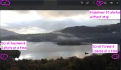
I picked a random post with 10 photos. This is what I can do: I can look at the photos by scrolling forward or backward, one photo at a time, and I can start a slideshow that displays all 10 photos, one after another. What more do we want?

Scroll:Slideshow.jpg
 
€2,-/day will present your project to thousands of visitors each day. All interested in the Camino de Santiago.
I think there is some confusion. At least I am confused. Turn on what again?

I picked a random post with 10 photos. This is what I can do: I can look at the photos by scrolling forward or backward, one photo at a time, and I can start a slideshow that displays all 10 photos, one after another. What more do we want?

View attachment 85198
I have just turned this on again..

What it is, is... before... when you click the "Forward" button on your screenshot above.. you would get the next photo in this post. When it had shown you all the photos in that post, there will would be no more photos.

Now (with this turned on), you can continue clicking "forward" since it will also include photos in other posts in the same thread... just try it on this thread.. I think it has 17 photos.. you see you can click forward and go through all 17 of them in the same window.
 
What may be useful: a short best practice post for posters who are not at ease with messing around with their photos and in particular who upload megabyte photos. Just: do this, do this, then do this. My guess is that "best practice" for the majority of posters would be the advice on how to upload their photos as thumbnails.

There are other methods, of course. I usually reduce a photo to make sure that it is way under 1 MB, upload it as a full photo, then edit it to reduce the size in which it is displayed.
 
I have just turned this on again..

What it is, is... before... when you click the "Forward" button on your screenshot above.. you would get the next photo in this post. When it had shown you all the photos in that post, there will would be no more photos.

Now (with this turned on), you can continue clicking "forward" since it will also include photos in other posts in the same thread... just try it on this thread.. I think it has 17 photos.. you see you can click forward and go through all 17 of them in the same window.
OK, I did it: I clicked on the first photo that had been posted in this thread. After a while, I saw a counter that told me that it was photo number 1 of 16 photos. I clicked forward, one at a time, to view all 16 photos posted in this thread. The whole process of viewing these 16 photos under this option took 9 minutes and 6 seconds! Some photos took ages until they were displayed.

The next thing I did: I clicked on the first photo in post #920 in the Where did you walk (locally) in 2020 thread. There are 10 photos in the post #920 and 74 photos in the whole thread. The first photo took a while to load. The counter said it was photo 25/74. I broke off after viewing 4 photos ...

It may not make a difference whether this option of viewing all photos in a thread without interruption is activated or not. Since the photos are displayed without any additional information, just the name of the photo that the poster had chosen, such as A58E96EE-6146-401C-8CC0-735C6173AE6D.jpeg, you don't even know what you are viewing and I don't see the value of this option for viewing dozens of photos in this way.

Just to make it clear, as I understand it: if this option is turned off again, it is still possible to view all the photos in a single post without interruption, right? Either as a slideshow or by scrolling forward through the post's photos.
 
Last edited:
Perfect memento/gift in a presentation box. Engraving available, 25 character max.
Ivar, on another thread I used the camera "drop in" feature, but it automatically made the picture full size. I tried to change it to a thumbnail, but instead of changing the large picture, it added it as an additional photo.
What am I doing wrong?
 
There are really quite a lot of whoppers among the photos of this thread: 1.4 MB, 1.5 MB, 1.8 MB, 2.6 MB, 3.0 MB, 3.4 MB, 3.6 MB, 4.6 MB.

BTW, out of curiosity, I downloaded the photos in this thread. It took less than 2 minutes. So I don't think it is the quality of my internet connection that made displaying the photos so excruciatingly slow during my earlier test.
 
Last edited:
The whole process of viewing these 16 photos under this option took 9 minutes and 6 seconds! Some photos took ages until they were displayed.
I have to add that I did the whole process again. This time it said that there are 22 photos in this thread to view. The whole process - clicking on one photo of the thread and then continuously viewing all the other photos in the thread - was reasonably fast. On iMac, iPad, iPhone ...

I can say the same for the Where did you walk locally in 2020 thread. I clicked on the first photo in the thread, was quickly told that it is the first photo of 154 photos in the thread. I clicked on Slideshow and the photos started to roll over the screen in a quick sequence. I observed the same good speed when using the forwarding option instead of the Slideshow option.

So why not have the option of being able to easily view all the photos in a thread if it doesn't slow down photo viewing in general? As far as I am concerned, I doubt that I am going to use this option very often.

There is, however, something odd: When I started with the first photo in the Where did you walk locally in 2020 thread, I was given a total of 154 photos in the thread. When I started with a photo posted much later in the thread, I was given a total of only 74 photos in the thread. FWIW. I'm not planning to look into this any further. 😁
 
Last edited:
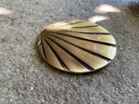
The one from Galicia (the round) and the one from Castilla & Leon. Individually numbered and made by the same people that make the ones you see on your walk.
Another nice new feature is the gallery option when viewing all the photos in a post or in a thread:

View attachment 85212
I do like the Who / date and time stamp below the displayed photo so if you want to find the post the photo came from you can fairly easily. I did scroll through all photos in this thread and it was faster than scrolling through the thread and clicking on each post and scrolling through the photos within each post prior to moving on to the next.
 
The 2024 Camino guides will be coming out little by little. Here is a collection of the ones that are out so far.
Ivar changed some code since I last performed a test inserting images. I ran a new test on the four ways I know of normally inserting images into posts (I previously thought there was three but the fourth method has been brought to my attention; I do know a few uncommon methods that are beyond the scope of the tests). This is rather boring reading but if I did my job it saves you from even more boring experimentation. Two of the insertion methods produced the same result. By the way, I posted thes in a thread that was created for tests of these sort. I deleted the posts afterwards and so the URLS to get the images mentioned no longer work.


I took a very large PNG file and cut out a portion to make a JPG file. This had dimensions larger than could be displayed by either my desktop or smartphone. I saved the JPG with 100% image quality.

Filename: image.jpg
Dimensions: 1728 h x 3072 w
Megapixels: 1728*3072=5308416 5,308,416
File size: 817327 (798.2 KB)

That file was exact copied to drop-in.jpg, full-size.jpg,insert.jpg, and thumbnail.jpg. Each of those was inserted into a post, one image per post. The text of each post was the name of the file. The method of insertion was the same as the name. The HTML source of the resulting page was examined to see what the resulting small picture picture was like (if any) and the same for the large version of the picture.


Test 1)

Filename: drop-in.jpg

Method: This image was posted by clicking on the mountain landscape icon and then clicking on the resulting "Drop image" box. I then browsed to select (rather than drop in) the drop-in.jpg file. I then clicked on the "Post reply" button.

Result: There was no small picture. There was a full size picture filling up the entire width of the post. This picture was smaller than the drop-in.jpg image though (the width and height were less than the 1728 h x 3072 w). This is because the browser scaled down the image to fit the space available for it. When the image was saved to a file it had the expected dimensions of 1728 x 3072 and had the expected file size of 817,327 bytes.

The picture was on Ivar's server and had the URL of https://www.caminodesantiago.me/community/attachments/drop-in-jpg.85240/ where the 85240 was the image id that you see with "Attach" statements.


Test 2)

Filename: full-size.jpg

Method: This image was posted by using the "Attach files" button. That brought up an image where there was a "Insert..." menu item overlaying the top left of the picture. That was clicked on and then the "Full image" item selected. I then clicked on the "Post reply" button.

Result: The same as drop-in.jpg except the URL was https://www.caminodesantiago.me/community/attachments/full-size-jpg.85241/ (image id = 85241)


Test 3)

Filename: insert.jpg

Method: This image was posted by using the "Attach files" button. That brought up an image where there was a "Insert..." menu item overlaying the top left of the picture but I did nothing with it. After the image came up I clicked on the "Post reply" button.

Result: A distorted version of the image came up. It was square and appeared to be 500 pixels x 500 pixels. It was somewhat blurry and at the bottom was overlayed with text presenting file information. If you clicked the image you would get a larger version of the image that was sharp. How that got done seemed to be browser dependent. The image was displayed smaller than the expected size due to the browser scaling the image to fit the space available to it. Saving the image to a file resulted in the expected result of a size of 817,327 bytes and dimensions of 1728 x 3072.

The HTML for the webpage used two images to make this presentation. A scaled down version of the large image was created where the shorter of the dimensions was scaled to 100 pixels. In the test case this resulted in a jpg of 178 w x 100 h (the file size was 5,011 bytes). The file was stored on a remote server accessible with the URL https://caminoforum-4df7.kxcdn.com/data/attachments/83/83976-95afd9ca43a36bf09864ef6e7ace5356.jpg and it was this file that Javascript used to create the 500 x 500 blurry image. (The closer the original image is to being square the likelier it will be that the small, clickable, image will be clear). The HTML source indicated that when the small image was clicked the large image on Ivar's server should be displayed though Javascript. That image has the URL https://www.caminodesantiago.me/community/attachments/insert-jpg.85242/ (image id = 85242).


Test 4)

Filename: thumbnail.jpg

Method: This image was posted by using the "Attach files" button. That brought up an image where there was a "Insert..." menu item overlaying the top left of the picture. That was clicked on the "Thumbnail" item selected. I then clicked on the "Post reply" button.

Result: The post contained a clear thumbnail image of the original where the shorter of the dimensions was scaled to 100 pixels. In the test case this resulted in a jpg of 178 w x 100 h (the size was 5,011 bytes). The file was stored on a remote server accessible with the URL https://caminoforum-4df7.kxcdn.com/data/attachments/83/83976-95afd9ca43a36bf09864ef6e7ace5356.jpg (the same as for test case 3). The HTML source indicated that when the small image was clicked the large image on Ivar's server should be displayed though Javascript magic. That file was accessible though the URL of https://www.caminodesantiago.me/community/attachments/thumbnail-jpg.85243/ (image id = 85243). The large image was again scaled to fit the space available for it. When saved to a file it had the expected result of a size of 817,327 bytes and dimensions of 1728 x 3072.
 
Perfect memento/gift in a presentation box. Engraving available, 25 character max.
Method: This image was posted by clicking on the mountain landscape icon and then clicking on the resulting "Drop image" box. I then browsed to select (rather than drop in) the drop-in.jpg file. I then clicked on the "Post reply" button.

Result: There was no small picture. There was a full size picture filling up the entire width of the post.
When I follow the above method, the image below is what I got on my screen, before clicking "Post reply." You can see that there was a large picture in the post area - which I could delete it - and a thumbnail below, which will stay even after I delete the large one.

This is the same method I used before the upgrade.

I also appreciate Rick's investigation. I was just wondering if he reached any conclusion about the advantages or disadvantages of the methods, for the average user.

Capture.webp
 
I also appreciate Rick's investigation. I was just wondering if he reached any conclusion about the advantages or disadvantages of the methods, for the average user.
Thank you. For the average user I would say to avoid using the landscape icon. The reason is because the user may think that using the "Image..." menu on the lower, smaller image will modify the way the upper, larger image will eventually be displayed but instead it will cause the image to be displayed twice in the same post. This is what was happening with the posts that @Camino Chrissy was doing.
 
The one from Galicia (the round) and the one from Castilla & Leon. Individually numbered and made by the same people that make the ones you see on your walk.

❓How to ask a question

How to post a new question on the Camino Forum.

Most read last week in this forum

This morning I am not only getting emails about watched threads, but also the little "alert" bell is showing up when it wasn't yesterday. I went into my preferences and see now that there are a...
I am trying to change my profile to indicate the three years I have walked the camino, and can't figure out where to edit that section. Please advise!

Featured threads

❓How to ask a question

How to post a new question on the Camino Forum.

Featured threads

Forum Rules

Forum Rules

Camino Updates on YouTube

Camino Conversations

Most downloaded Resources

This site is run by Ivar at

in Santiago de Compostela.
This site participates in the Amazon Affiliate program, designed to provide a means for Ivar to earn fees by linking to Amazon
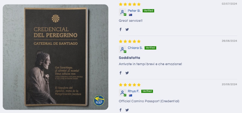
Official Camino Passport (Credential) | 2024 Camino Guides
Back
Top