naplesdon
Veteran Member
- Jul 14, 2012
- 4,522
- 13,393
- Time of past OR future Camino
- Multiple Caminos 2010 to 2019
Good graph. Do you have the link from where you found it?I'd love to go take a wander on the beach next to my building but there are hordes of mindless fools here in Florida for spring break. You simply have to start believing.View attachment 71067
Never mind. I found itGood graph. Do you have the link from where you found it?
Right, I found it on his Twitter feedYes and no, it was information gathered by a British writer who works for the FT, his name is John Burn-Murdoch.
If I look at
I see that China has stopped the exponential growth of the cases. They try to start their economy again... and I hope very much that they can do it without starting the exponential growth of the cases again. If they can do it and the numbers are true it can be done.COVID Live Update: 140,662,975 Cases and 3,015,167 Deaths from the Coronavirus - Worldometer
Live statistics and coronavirus news tracking the number of confirmed cases, recovered patients, tests, and death toll due to the COVID-19 coronavirus from Wuhan, China. Coronavirus counter with new cases, deaths, and number of tests per 1 Million population. Historical data and info. Daily...www.worldometers.info
The strict measures against corona started in Europe about a week or half a week ago. So it will take maybe one or two weeks until we hopefully see the first results.
I think it is too early that you can say anything. I can only wait and see until the governments and WHO (World Health Organization) say we can travel again... but for me there is still the hope for a camino in 2020.
I see that China has stopped the exponential growth of the cases.
It's never been exponential ; it's following a typical bell curve.
No, not bell curve, as is inverted curve, therefore exponential.
sigh ... This is my positively LAST post on this ...
Curves can only be exponential in an infinite environment ; but the number of human beings is finite. Even assuming a perfect 100% incidence of contagion of person to person, the curve would be at very worst logarithmic, not exponential.
You just can't see a bell curve from pure numbers until after it has reached peak and started to descend. As this one will, as there is not a 100% mortality rate either.
Yes I am being pedantic, but this one does seem to annoy me more than usual sorry ...
No, not bell curve, as is inverted curve, therefore exponential.
Given the high rate of growth, it's much better to plot the number of cases with a log scale - this also allows you to compare the resulting slopes for different countries
Are the cases less "active" for a particular reason?
It's never been exponential ; it's following a typical bell curve.
No, not bell curve, as is inverted curve, therefore exponential.
sigh ... This is my positively LAST post on this ...
Curves can only be exponential in an infinite environment ; but the number of human beings is finite. Even assuming a perfect 100% incidence of contagion of person to person, the curve would be at very worst logarithmic, not exponential.
You just can't see a bell curve from pure numbers until after it has reached peak and started to descend. As this one will, as there is not a 100% mortality rate either.
Exponentials can be achieved until the end of the series, they do not need to be infinite, especially in finite environments. Until it descends/reduces it is not a bell curve - it may be seen as a bell curve after we have data from the end of it - if there is an end to it.
Is there a '.... for Dummies' book on this stuff?!
When graphed, exponential growth always looks like it is starting off slowly and then rapidly becomes steeper. It's a lot like spreading gossip about your ex: you might only tell your two best friends that he cries during chick flicks, but each of them tells a couple others, and pretty soon there is no one in the Western Hemisphere that doesn't know his secret - thanks to the power of exponential growth.
The bell curve is not appropriateAnd just a clarification - @Kathar1na please correct me if I'm wrong - about the business of an exponential versus a normal ('bell' ) curve:
A normal curve describes a probability distribution, not a time sequence - which is what an exponential curve describes.
So when an exponential curve reaches its asymptote, and maybe declines after that, the shape may mimic a nirmal curve, but what it describes is something else altogether.
The bell curve is not appropriate
Between 2:30 and 2:40 he says R^2 is 0,975 which is very close to 1,000 ( = perfect model) which means the development of the real cases are very close to the numbers estimated by this model....
It's around 2:30 into an excellent video clip that was posted on the forum some time ago. The guy says:
It lets as be able to be a little more quantitative about how exactly close the exponential fit really is, and to use the technical statistical ..... here, the answer is that it is really freaking close.What does he say after statistical?
From yesterday's Guardian: I'm an ER doctor. Please take coronavirus seriously. 
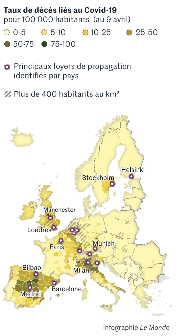
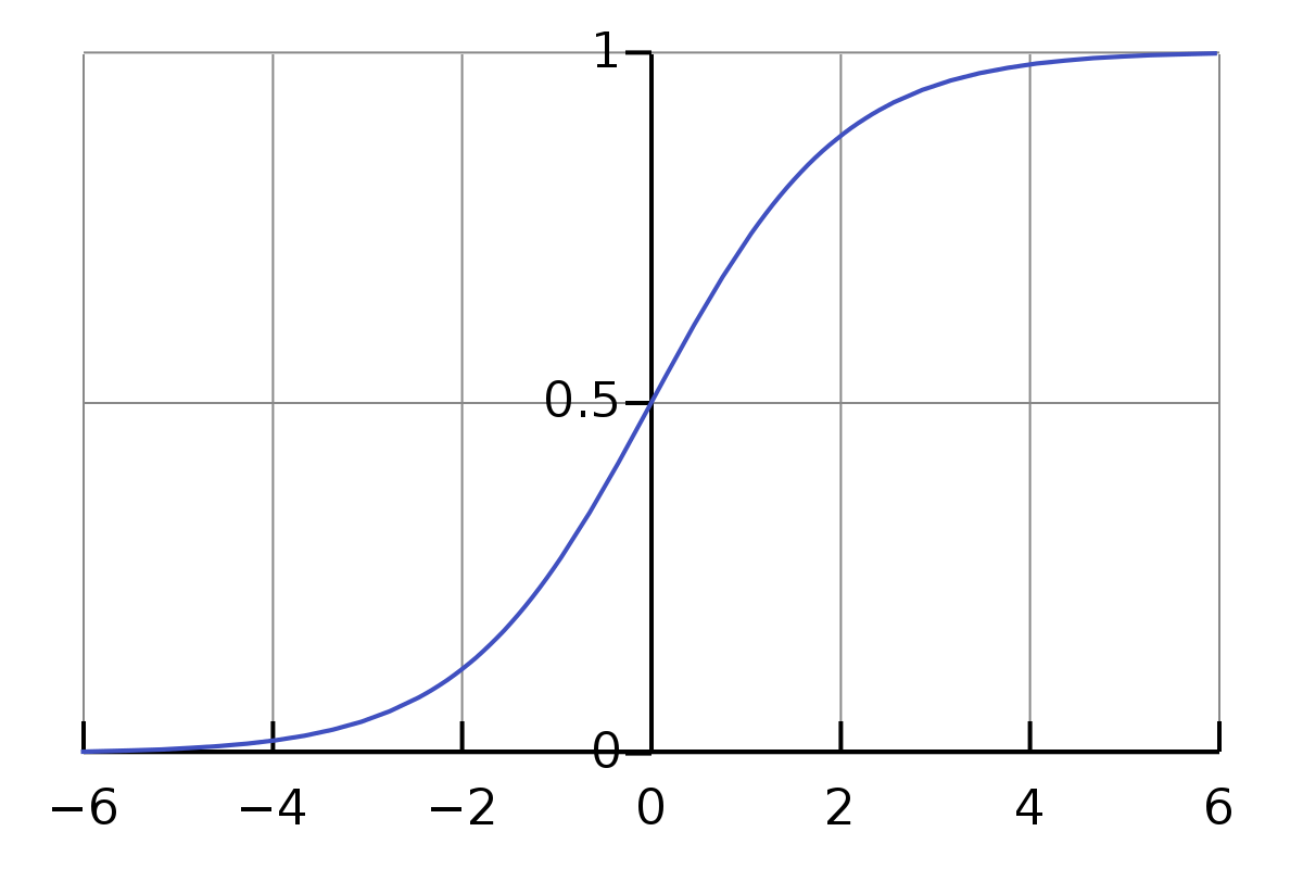
Most people don’t understand exponential growth. The article isn't about math(s) as such but it has a graph of confirmed Covid-19 cases for a number of countries from the day they had reached 100 confirmed cases in each country.
The scale is logarithmic, i.e. the axis on the left, the one that goes up, is not divided into segments of 1,000, 2,000, 3,000 but segments of 1,000, 10,000, 100,000. The coloured graphs for Italy, Spain, UK, and the US look very much like straight lines going upwards. This is exponential growth in the mathematical sense. The lines are "above" the 6-day doubling trajectory. This means that confirmed cases currently double in less than 6 days. The measures taken by regional or national governments aim to break or bend these lines. That's what we all have to achieve by doing as we are told.
And time is of the essence. Or, as the writer, an emergency medicine resident physician at Massachusetts General Hospital in Boston, puts it: Our inability to appreciate how extraordinarily powerful exponential growth can be has concrete consequences. [...] It’s also why people seem to be struggling to understand why every single day matters enormously in limiting the spread of the coronavirus, which follows an exponential growth pattern.
View attachment 71455
It is my understanding that it takes at least 7-10 days before the extreme measures ("lockdown") will show any effect in these graphs. I think the main point of this graph is the fact that development is so similar in all these countries, ie the fast exponential growth in the beginning phase and that this growth is typical for this kind of infectious diseases, once started, there is an automatism that is hard to grasp for many laypersons.This plot intrigues me.... [...] If my interpretation of the graphic is correct, this would seem to have been a case of "too little, too late"...
In terms of preventing widespread infection, perhaps. From the very beginningthe initial response of just about every country, whatever strategy they have adopted has been quite ineffectual
There's a difference between dissemination and numbers infected in any given area. It's everywhere right now. That's water under the bridge. As I understand it, the task now is to minimize numbers so as not to overwhelm hospitals with the masses of cases that could be coming. And I hope you're wrong. Because, yes, it may be to late for even that.If my interpretation of the graphic is correct, this would seem to have been a case of "too little, too late"...
The German RKI, the leading infectious diseases institute in that country, gets often asked by reporters why in particular their number of fatalities is so strikingly low. From their faces, I don't see that they rejoice in that fact. They said yesterday that everyone who has a confirmed coronavirus infection, is ill and dies, is counted as a coronavirus death. They themselves don't really know why the number is currently so low but have a number of ideas - the current age profile of those infected is quite different in Germany than in Italy for example - patients are noticeably younger on average - while the percentages of old and very old people in the population are quite similar in Germany and Italy. Perhaps because many German Covid-19 patients had come back from skiing holidays initially and got infected there.For example, Italy reached this number [100 confirmed infected cases] around 23 February, Spain around 2 March, the UK around 5 March and Germany around 1 March.
Despite the fact that these absolute numbers (cumulative confirmed cases and cumulative deaths) are not directly comparable between countries because of different size in populations, different approaches of who gets tested and where this approach even changes over time, etc, they do illustrate the exponential growth during the initial stage. I've seen graphs in log scale for confirmed cases per population and also of deaths per population of 65+ years olds, and it is always a straight line that does not stop going up at the moment for European countries and for the USA (as a whole and the states most concerned right now).I think it is more relevant to look at rates per population than cumulative numbers. This tells you more about the impact (And data on number of tests, too, if we had them and how reporting is done). Italy has 69,176 cases. Spain has 42,058. But if you compare the numbers per population of each country, the rates are very close to the same.
If anyone is really interested in more details about this I recommend that you call up the Twitter feed of the Robert Koch Institut. They livestream their press conference every Monday, Wednesday, Friday at 10 am. Similar for Spain, look for the Twitter feed of SaludPublicaEs. You don't need to log into Twitter.Germany
I have barely glanced at more than two replies. You end your post by saying you simply have to start believing. I thank God for my poor little mind that resists any attempts to be taught about maths and graphs and stuff. I agree. We just have got to start believing. and keep our distance. And carry tissues. And clean our windows. Again and again and again. Please forgive me for introducing this, but it is not meant badly: The best book on maths I ever read (and I had to teach maths for years as a primary school teacher!) was entitled: Mister God This is Anna. I can recommend it. I lost my copy years ago, having lent it out and it was not returned. many people are quoting Juliana of Norwich at the moment. I quote an old nun, long since gone from this earth: When all is said and done, there is more said than done. Please, everyone, let today grow in exponential amounts of deep hope and belief in tomorrow and future. It's up to you.I'd love to go take a wander on the beach next to my building but there are hordes of mindless fools here in Florida for spring break. You simply have to start believing.View attachment 71067
Once people emerge from seclusion it's likely that there will be another spike in new infections. As well as perhaps a summer lull followed by an autumn resurgence. In the 1918 epidemic, the mortality rate in the second wave exceeded that of the first.es anyone spot any flaws in that reasoning ?
This would be a catastrophe for Spain and many more countries.Once people emerge from seclusion it's likely that there will be another spike in new infections. As well as perhaps a summer lull followed by an autumn resurgence. In the 1918 epidemic, the mortality rate in the second wave exceeded that of the first.
So I'd love for your analysis to be right, and what's happening now in China will be proof of the pudding. But historical precedent does not bode well.
Once people emerge from seclusion it's likely that there will be another spike in new infections. As well as perhaps a summer lull followed by an autumn resurgence. In the 1918 epidemic, the mortality rate in the second wave exceeded that of the first.
So I'd love for your analysis to be right, and what's happening now in China will be proof of the pudding. But historical precedent does not bode well.
I was really asking if there were any flaws in the analysis that I made of the statistics
if any real significant trends were spotted, I guess we would have been informed.
The initial 3 weeks of sharp increase was the "exponential" growth in China. The low increase was the phase when China had "controlled" their corona. And the next sharp phase was the "exponential" growth in "the rest of the world"....
And as I look at the chart of the total number of cases worldwide, logarithmic scale version, the curve seems to be broadly divided into three sections, each representing about 3 weeks in length.
An initial 3 weeks of sharp increase ; then 3 weeks of relatively low increase, then the past three weeks sharp again.
...
No, not bell curve, as is inverted curve, therefore exponential.
Given the plot is of cumulative number of cases, it can never trend down as a bell curve would
The French curve has flattened, though that may be because people with mild or no symptoms are no longer being tested -- still, it's encouraging.
No, but if you look at the active cases numbers instead, it can and it will.
If you are plotting cumulative cases, it is IMPOSSIBLE to have a bell curve. If you see a bell curve, you are recording incident cases, not prevalent.
Agreed - but the plot under discussion is of cumulative numbers of cases against number of days since 100 cases....
That has already been established several times in the thread.
Ooooh, I am feeling a bit excited right now so I hope the moderators will forgive this excursion that goes a bit deeper into mathematics - after all, this IS the math(s)/coronavirus thread. It appears that the derivative of a logistic curve is a bell shaped curve. We know already the meaning of the former in the context of this discussion but the latter has apparently also a specific meaning in this context. I'm just paraphrasing what I read on the internet, it goes a bit above what I can do on the back of an old envelope myself right now. I quickly googled for an image as an example. Logistic curve in blue, corresponding derivative in red. How cool is that?!Given the plot is of cumulative number of cases, it can never trend down as a bell curve would - rather it follows the general form of a logistic curve...
Here's an article, there must be many more: Generalized logistic growth modeling of the COVID-19 outbreak in 29 provinces in China and in the rest of the world. Quote: The logistic growth model can capture most of the dynamics at the cumulative level, daily increase level (1st derivative) and the daily growth rate level (2nd derivative). The paper has been published on arxiv.org, an open access archive hosted by Cornell University.We know already the meaning of a logistic curve in the context of this discussion but its derivative has a meaning in this context, too
The "bell curve" in this paper:Here's an article, there must be many more: Generalized logistic growth modeling of the COVID-19 outbreak in 29 provinces in China and in the rest of the world. Quote: The logistic growth model can capture most of the dynamics at the cumulative level, daily increase level (1st derivative) and the daily growth rate level (2nd derivative). The paper has been published on arxiv.org, an open access archive hosted by Cornell University.
You don't need to read the whole text, there are plenty of graphs. Note that all these graphs don't predict anything for sure. They are adapted from day to day according to the available data to make the curve fit. The data produce the curve; the curve doesn't produce the data.
Moderators: I don't mind in the least if you feel it is time to close this thread. But I rather fill my time in solitary confinement (I am already on day 13!!!) with the topic of this thread than with cleaning my windows. ☺
I think that it was a brilliant idea for this thread to be started - not that I am reading it carefully! Enjoy!Moderators: I don't mind in the least if you feel it is time to close this thread. But I rather fill my time in solitary confinement (I am already on day 13!!!) with the topic of this thread than with cleaning my windows. ☺
Voila!the derivative of a logistic curve is a bell shaped curve.
You know, that actually sounds vaguely (very vaguely) familiar to me. Or at least is is an immensely satisfying situation.It appears that the derivative of a logistic curve is a bell shaped curve.
different ways of presenting the same data...I think that it was a brilliant idea for this thread to be started - not that I am reading it carefully! Enjoy!
That is indeed interesting: a graph that isn't plotted against time. Thanks!I found this interesting. New confirmed cases versus total confirmed cases, both on a logrithmic scale.
From the London Spectator (written by Dr John Lee a professional pathologist) :
The data on Covid-19 differs wildly from country to country. Look at the figures for Italy and Germany. At the time of writing, Italy has 69,176 recorded cases and 6,820 deaths, a rate of 9.9 per cent. Germany has 32,986 cases and 157 deaths, a rate of 0.5 per cent. Do we think that the strain of virus is so different in these nearby countries as to virtually represent different diseases? Or that the populations are so different in their susceptibility to the virus that the death rate can vary more than twentyfold? If not, we ought to suspect systematic error, that the Covid-19 data we are seeing from different countries is not directly comparable.
Look at other rates: Spain 7.1 per cent, US 1.3 per cent, Switzerland 1.3 per cent, France 4.3 per cent, South Korea 1.3 per cent, Iran 7.8 per cent. We may very well be comparing apples with oranges. Recording cases where there was a positive test for the virus is a very different thing to recording the virus as the main cause of death.
Early evidence from Iceland, a country with a very strong organisation for wide testing within the population, suggests that as many as 50 per cent of infections are almost completely asymptomatic. Most of the rest are relatively minor. In fact, Iceland’s figures, 648 cases and two attributed deaths, give a death rate of 0.3 per cent. As population testing becomes more widespread elsewhere in the world, we will find a greater and greater proportion of cases where infections have already occurred and caused only mild effects. In fact, as time goes on, this will become generally truer too, because most infections tend to decrease in virulence as an epidemic progresses.
I freely admit that I didn't read the article (or is it a reader's letter?) either. In fact, I am skipping over most of the stuff that deals with "numbers" in contrast to those that deal with "math(s)".The plot that started this thread is of "number of cases" (ie positive tests) and not the number of deaths... Consequently, on the assumption that e compilers of the information are competent and capable of differentiating between infections and deaths, we can be reasonably happy that the plot compares apples with apples.
This raises a number of questions in my mind... I have not read the full article so I may be misinterpreting some of the arguments in it and I am happy to be corrected...
The plot that started this thread is of "number of cases" (ie positive tests) and not the number of deaths... Consequently, on the assumption that e compilers of the information are competent and capable of differentiating between infections and deaths, we can be reasonably happy that the plot compares apples with apples.
The article does not consider the effects that management may have had on the spread of the virus - exclusion of foreigners, self-isolation, forced quarantining of infected people, and the health care that can be offered.
These clearly change from country to country and from time to time, and may well be sufficient to cause the different infection responses without having to invoke systematic errors, differing susceptibility, or different strains of the virus in different countries.
The value of testing in understanding the impact of the virus on the population as a whole is well made. It is indeed quite likely that the actual morbidity rate per unit infection is substantially lowered that what is currently understood because of limiting testing to those who are clearly ill and have had clear opportunity to become infected. If a random sample of the population was tested, the proportion of the population that has been infected without severe health effects would probably rise substantially. Different testing regime sin different countries may give rise to different infection rates
Lastly, I cannot see waiting for the virulence of the virus to attenuate becoming an acceptable model for infection management
In fact, I am skipping over most of the stuff that deals with "numbers" in contrast to those that deal with "math(s)".
The issue (still) at hand is how fast the number of people grows who are seriously ill and who require hospital treatment and whether the hospital capacities (rooms, special equipment, staff trained in using the equipment on a patient, supplies) within a city, or within a region, or within a country can deal with the workload created by these cases. I have little doubt that those who are in charge of modelling and interpreting data and ongoing results know how to do this properly.
As I said, I haven't read this article by a retired pathologist, just glanced quickly through the comments here. On this wobbly basis I make the following bold judgement: the issue that is addressed here is how do general purpose journalists and general purpose media report about specialist issues in the field of medicine and research and related topics and how do the readers process the information presented by them.But Dr Lee's articles are addressing a different question of statistics than that.
This is such an interesting articleArticle :
Tracking the coronavirus: why does each country count deaths differently?
France only records Covid-19 fatalities in hospitals, Spain does not include unconfirmed cases in senior homes, and the Netherlands only tests hospitalized patientsenglish.elpais.com
We can take little comfort from the thought that the 684 deaths announced today were, most likely, in addition to the national daily average 1600.
Seems to me that China has their reduction because they have the ability to complete shut down and isolate cities of fifteen million people .. I just cannot see that sort of thing happening in the western democracies .. in my country (UK) we are now forecasting an absolute minimum over the next few months of 20,000 deaths and our worst case is 260,000 deaths ..... sure, if we could enforce martial law and totally quarantine tens of millions of people we could control it, but we cannot .. what is coming is coming - God help us all.
Thanks. I've not found a video yet but I found an up to date written summary of their model: Ontario - COVID-19 Modelling. This summary is done well!The medical experts who advise the province of Ontario (Canada) just gave a presentation (and answered press questions) on their model. It is likely online already ... or will be soon. It was covered by Globalnews, CBC, and others. They mention a second and possible third waves, going forward 18 - 24 months.
Disregarding.I'm a (retired) epidemiologist. And I'd like to ask you all to stop talking dirty to me in this thread. Carry on.
I had heard a suggestion that the confinement measures were lowering deaths from the flu and other sources, casting into doubt the idea that Covid19 was causing an increase in mortality in the general population.
Needless to say, I was sceptical -- particularly as I could find no corroboration of this theory.
Well, the French are good at statistical analysis, and good at examining such questions dispassionately.
Le Monde here -- https://www.lemonde.fr/les-decodeur...ement-depuis-le-1er-mars_6035485_4355770.html -- does just that, and it shows a clear increase in mortality in the regions and areas worst affected by this outbreak -- up to +141% in the Haut Rhin département.
This is despite the drastic reduction in mortality from car accidents due to the confinement measures.
So : debunked.
I don't think you can extrapolate numbers from France to all countries.
Seeing low covid-19 death numbers from other countries like Taiwan, South Korea, Finland, Australia and New Zealand, it wouldn't surprise me if the situation is much the same there.
I know something . They distinguish between lethality (death per infected population) and mortality (death per population). I am currently listening to a press conference from the people who present the first results of in-depth study of a population in a small focus area in Germany where one of their outbreaks started. The area is called Heinsberg, the study was done for the town of Gangelt (2500 inhabitants).A definitional issue here - how is mortality defined? deaths as a proportion of the population, or deaths as a proportion of infected people?
I had heard a suggestion that the confinement measures were lowering deaths from the flu and other sources, casting into doubt the idea that Covid19 was causing an increase in mortality in the general population.
...
So : debunked.
Thanks for posting. The Le Monde infograph that you posted is a good visual, independent of how the underlying data are collected and independent of their degree of comparability or lack thereof. Stunning to see how large the area is that is severely inflicted in Spain. The infograph also shows the focal points in each country (even when they are not comparable between countries in absolute figures or per capita figures). Lots of good information out there. Do I now add the Le Monde blog to my reading list, too???Le Monde has created a graphic showing the areas of Western Europe worst affected